
Wal-E
Walmart-Enterprise Design System
Why Design System?
-
Consistency
-
Higher quality
-
Better Communication with Development Team
-
Faster Design Process
-
Focus more on UX, less on visuals (except colors)
How Wal-E is different from any other system that we are using in Walmart?
-
Designing component for our enterprise applications which are data heavy, lots of form and field etc
-
Designing component keeping in mind different type of touch devices our user interact with in different environment.
My Role
-
Research on Existing products and Devices to understand the requirement
-
Designing the elements, testing the accessibility
-
Create: Identify need for a component. Add the component to the Wal-E and write usage guidelines.
-
Style each component is according to the design specs found in Wal-E. Components function correctly and match usage guidelines. pajamasstyle
-
Integrate: Integrate the documented component into the product.
Fundamentals

What is the Wal-E Design System?
The goal of Wal-E is to be the single source of truth for the robust library of UI components that we use to build the Walmart product, including usage and implementation guidelines.
As a fully implemented design system, Wal-E includes:
-
UX/Design Philosophy: Walmart labs have strong foundational principles by which we work, and Wal-E reflects those values—
-
Contribution Guidelines: We clearly outline how anyone can contribute to Wal-E through issue creation/discussions, component documentation, designs, and/or code.
-
Component Documentation: Every component includes guidelines for Interaction (how it works), Visual (how it looks), and Usage (how you should use it).
-
Page Layouts: We clearly document page layout options and our grid implementation.
-
Content Guidelines: We provide voice and tone guidance for our UI that aligns with Walmart labs’ brand standards.
-
Accessibility Guidelines: As a company, Walmart strongly believes that everyone should be able to contribute. That means we must always consider how to design and code in an adaptive way to support our users, regardless of their abilities.
-
Developer Resources: Our components include live code snippets and developer documentation based front end.
-
Designer Resources: We provide tools to make designing easier—for example, our Sketch pattern library.
AMA allows:
-
Search and onboard existing suppliers
-
Invite new suppliers to onboard
-
Retrieve supplier contracts
-
Create and renew agreements
-
Participate in contextual conversations with all parties involved in an agreement (finance, legal)
AMA has 15 different users and talks to 8 different applications.
Launched on 8th October 2020, 5000 users

Colors
Our colour palette is built with our core principles and it’s foundation. This colour palette will be used for digital products used by our associates. Colour palette has 9 core colours.


Our color palette is built with our core principles and it’s the foundation. This color palette will be used for digital products used by our associates. The Colour palette has 9 core colors.
Grids & Spacing


Typography
Walmart has an official Typeface named ‘Bogle’. It is recommended to use Bogle for associate digital experiences.
Type scales were carefully crafted based on our 4px baseline grid.
Wal-e type stack specifies 16px for the base font size, which produces an 8px x-height. The x-height is halved to produce a 4px baseline. All text flows vertically along this baseline, creating a similar rhythm across all screens. This rhythm is created by the line height between each line of text and the margin between elements.


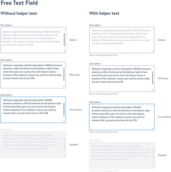
Input Field
Input fields or Text fields are one of the most important component of any digital product. Applications will always require one-time or recurring input from user in single session. Input fields are used to enter and edit text inputs. Based on Baymard Institute’s Usability Study, Material Design Research and current best practices across popular brands like (Medium, Quora, Amazon, Airbnb, Atlassian etc.) we have come up with our own set of guidelines and library when it comes to the Input Field design.
There are few things to keep in mind when using text fields in your project. Those are mentioned below.

5 Things to consider*
-
High visibility of field and label (accessibility)
-
Structure of the field (appearance)
-
The behavior of the input field (interaction)
-
Meaningful text label of the corresponding field (UX writing)
-
Assistive elements (helper text, feedback, trailing icon etc.)
*In this document we are going to talk about the Accessibility and Structure of the Input Field in detail.


System Status Communication Widgets
As the world of interaction design gets more and more organic, it is our job as designers to help the user be engaged and focused at their primary task while keeping them informed about system status, validations, notifications in a meaningful way. As described by Mihaly Csikszentmihalyi, people are at their happiest in a state of flow, when they’re able to focus and be completely absorbed in the task at hand.
To communicate the feedback to the users properly, communication UIs such as Indicators, Validations, Notifications and Dialogue boxes has gone through a lot of evolution to ensure the state of the system is always visible is one of the 10 usability heuristics for interface design. In this section we are going to talk about and give examples of such UIs.
5 Things to consider*
Based on the research by nngroup there are few things to consider when choosing the best way to design for system status. We have also added some additional points after going to some popular design systems (like material, atlassian etc.)
-
Priority of the message
-
Type of information being communicated to the user
-
Global or Contextual
-
Triggered by user action or system event
*In this document we are going to talk about the Accessibility and Structure of the Input Field in detail.

System Status Communication Widgets
Usage
Flags are used for confirmations, alerts, and acknowledgments that require minimal user interaction. Show these event-driven messages by overlaying the message at the bottom left of the screen, as if it was emerging from the navigation sidebar.
Flags can close automatically (fade from view after 5 seconds, dismissable at any time), or they may require manual close action. This close action may be a close icon in the top right corner, or a user may be required to interact with the flag before it closes.
Title and message:
You can have a flag with a normal weight message and a separate bold title, or you can combine the message and title into one line and use bold text for the whole line. Try to keep text of message concise: it can be up to two lines in length, not including action links.
Actions (optional):
A maximum of two links that allow users to respond to the flag's content.
Dismiss icon (optional):
Use this to dismiss the flag, usually without performing an action. This appears on hover for automatically closing flags, and is always visible for manual closing flags. If not present, the flag must close after an action is taken.
